Website goals
Dieux came to us with a cult following of loyal customers due to their founder's social media presence, but wanted to optimize their website to provide a continuous user experience for customers as well as improve accessibility.
What I worked on
I was the main UX designer for the full site redesign that launched in May 2022. I continued to work with them until 2023, conducting site audits and making updates as their business needs evolved, as well as supporting the marketing team with audience-specific landing pages.
Results
- Improved overall accessibility
- Improved SEO in conjunction with our marketing team
- Improved retention rates on landing pages
- Lowered bounce rates
- Increased conversion rates
Site map to support brand expansion
Dieux was looking for support as they wanted to add new products and pages to their website, such as an Ingredients page and a Clinical Studies page. I reworked the site map and navigation menu to show them how we planned to structure their website and web pages. We also pitched creating a new template for bundled products vs individual products, which they agreed would help them manage products in the backend.

Navigation menu
Since they only had a handful of products at the time and plan relatively spaced-out launches, I prioritized having a clean, intuitive menu while knowing we'd revisit the design in a year or so.
Design exploration

Option 1
This version focused on the 4 main products Dieux was offering at the time.

Option 2
This version required us to create more collection pages, but would support a larger product variety in the long run.
Homepage
Dieux looked for our expertise in improving accessibility and SEO on their website. They wanted to prioritize brand discovery for prospecting audiences, as most retargeting audiences were completing purchases already due to the founder's loyal social media following. My goal with this redesign was to add more educational storytelling elements to the page so visitors who aren’t familiar with Dieux can skim through the page and learn about their brand values.
What was launched
Here I show the desktop version for easy viewing, but most of Dieux's traffic came from mobile devices so we designed for mobile optimization.


.webp)
Product page
Dieux had been adding important information into their image carousel rather than in the page template itself. To improve SEO and accessibility, I moved that information into new modules with live text.
Design exploration
chart with Icons
This version was more visual, but would be more difficult for Dieux's team to edit without our support if they wanted to add or remove an item.

pricing List
This version would be easier to maintain in the long-run, and the breakdown of costs was still clear and intuitive, as the receipt layout is familiar to users.
What was launched


.webp)
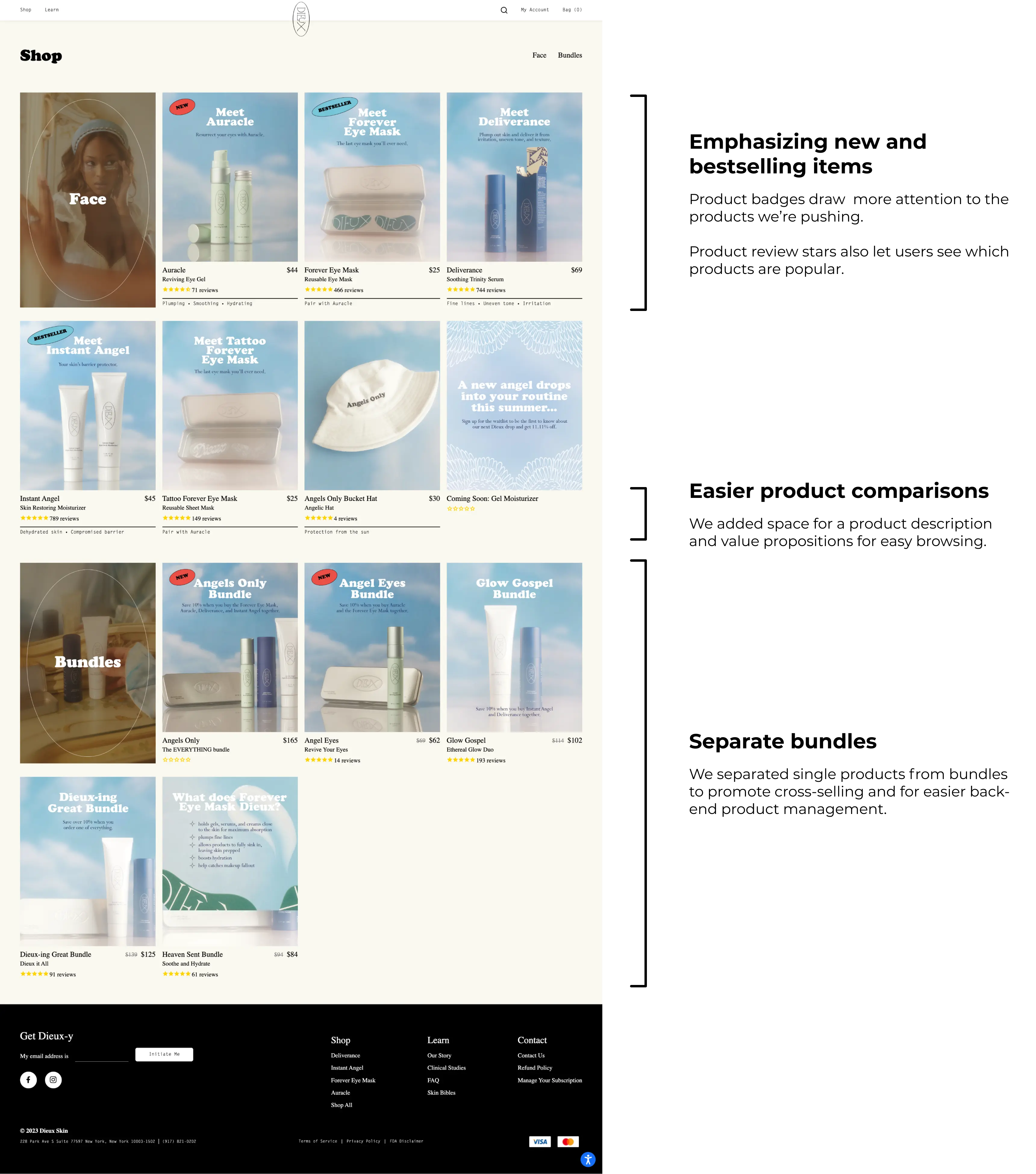
Collection page
When we first started working with Dieux, they only had 3 single products and 3 bundles and didn't have a collection page yet. In order to accommodate for their growing repertoire of products, I designed and built a collection page so users had a place that listed all of their items. This page is a high-performing landing page for retargeting audiences, so I wanted to include more product education as well and added product descriptions, star reviews, and badges.
Design exploration

Icons
This version used a large title card to separate collections within the page.

List
This version used large title text to separate collections and used larger product cards.
What was launched
Dieux fell in love with the large title cards, so I consolidated their feedback for launch.
Impact
- Improved overall accessibility
- Improved SEO in conjunction with our marketing team
- Improved retention rates on landing pages
- Lowered bounce rates
- Increased conversion rates
Learnings and next steps
It had been a challenge designing without knowing what information the client would be able to produce, and I had to revisit a couple modules before launch to make them more flexible — for example, I had included a timeline module on the PDP so users could see when they should expect results, but Dieux's team ended up wanting more space for details, as everyone's skin is different and they can't guarantee the same results and efficacy for everyone. I ended up scrapping the timeline visuals and just making it a list of headers and body text so Dieux had more flexibility with the content.
Dieux's website was still a work in progress when I left the team, as I had just completed an audit with their team and had already determined next steps. Look forward to updates on their homepage (especially more before/after images), as well as a more refined product page.