
Adobe XD
Optimal Workshop
At first glance, it's obvious that Curology's website is not mobile-oriented. I have attempted to start a new consultation on my phone and ended up opening up my laptop instead because the UX was frustrating; I couldn't tell if I had selected any photos, there was no back button, and when I pressed the back button on my built-in Android navigation, it took me right back to the beginning. Honestly, even the website itself has flaws (for one, I still couldn't tell which photos I had selected), but I chose to use a mobile-first approach for this redesign.

Screenshots of Curology's design on a mobile device
I used Optimal Workshop and shared the link to The Curology Group on FaceBook. Only 7 Curology customers completed it before it was taken down from the FB group.
Note: While I did learn from this survey, I didn't ask the right questions. I assumed I would be able to post multiple surveys & recruit for interview participants on the Curology FB group whenever I had more questions, but alas, it was taken down for violating group rules (oops!). With this restriction, I wasn't able to conduct as much user research as I should have or receive answers to all the questions I wanted to ask.
The responses verified my personal experiences with the website. People found it hard to navigate and difficult to find information, and while most had opened the site on their mobile device, most seemed unsatisfied with their experience. The overall NPS score was -14.

Looking at the scoring, it may seem as though the mobile experience is average; not too bad and not too great. However, looking through the responses to more open-ended questions showed the individual who rated their experience a 10 was participant 13 (see image below).

The main thing that sets Curology apart from other skincare companies is the customized prescription formula. Their brand position means that users must view them as trustworthy, professional dermatologists but still have a friendly and personable touch.
Most users will only open the application when they are experiencing skin problems or shipment issues, so certain features must be easy to find even if they haven't used the app in a while.
Looking at the main navigation bar of the existing design, I wondered if those were even the main pages users would go to. I, for one, never go to the "Notifications" page, and it could easily be a sub-page. When I clicked on "More", I wondered how I could consolidate everything into 3-5 main pages.

For the first iteration, I hypothesized that Treatment, Consult, Journey, Guides, and Account were familiar to Curology users and the most useful for the general audience, and thus should be included as part of the main navigation bar.
I later changed Treatment to Home to include shipment details and expert guides on the first screen users see (from user feedback during usability testing).
The original photo booth feature first shows the actual photo/collage with the side-by-side comparison template selected and a photo pre-selected as well. A quick scroll through the Community tab does lead me to believe this is the most common template chosen.
Once you've chosen to add the next photo, the template options disappear and you can only find them by clicking the left arrow button, which I only realized because of this project.
I played around with the design for this but ultimately settled on the typical collage format, keeping in mind the intended information hierarchy. I ended up splitting the process into two screens so as not to overload users with too many interactions on one.


The survey earlier helped me learn that Curology has a separate link to find Expert Guides, making it difficult for users to find information on their website. Multiple users stated that they referred back to these articles, so I felt it necessary to include them in the mobile app.
I adjusted the way they organized their expert guides; their labels included "Skin 101 (18 articles), Skin Care (19 articles), Skin Type (2), Skin Issues (1), and Skin Health (1). It was difficult to tell what an article about moisturizer recommendations would fall under (Skin 101 vs Skin Care?), and they didn't include a search feature.
After discovering that they had blog posts, I also decided to combine them to make a more robust and informative feature..
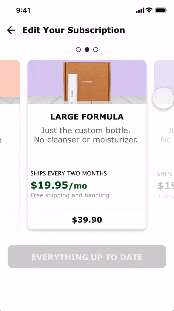
The original design was fine for laptop or tablet view, but not so much mobile; it had too much information for each selection and required too much scrolling without letting users know exactly how many options they had.
Since Curology currently offers only 3 subscription plans, it made sense to use a horizontal scroll so users could quickly and effectively see their options.

I conducted 4 moderated usability tests within my personal circle of friends due to time constraints and an inability to use the FaceBook Curology group to recruit participants. One was a current user of Curology, while I asked the other 3 to assume the role of a new customer.
They were prompted to walk through certain tasks to determine if the design was intuitive:
There were no major usability issues regarding the tasks given. However, there were a few suggestions/edits made to the app.

Solution: This was a challenge I hadn't seen coming — should I sort each group of photos by date, or should I sort by month and then year? This would make the screen have unaligned grids, and users would also have to scroll more when finding a photo from a few years ago. I considered adding a tool at the top which would allow users to plug in any specific year to search.
I looked at FaceBook, Instagram, and Google photos and ended up really liking the mechanism of the latter. It allowed users to see all their photos interrupted, but also allowed users to easily browse by month and year. Android users would be familiar and completely comfortable navigating their photo album this way.
Solution: include medication/allergy details on Profile in Account, and include list of ingredients to avoid on the Treatment plan.
Solution: use more familiar wording such as "Collage" and be consistent with terms.
Curology uses terms such as "Photo Booth", "Photocard", and even has their own icon that represents a hug. I would love to conduct research to determine if these are intuitive terms and features for new customers. For the purposes of this project, the terms should be adjusted to reduce confusion.
Solution: add a share button for the users that want to share photos/postcards with the FaceBook community or friends/family
After creating a more high-fidelity prototype, I posted the link to the CareerFoundry Slack group for feedback. Their UX/UI knowledge helped make the visual hierarchy stronger with a few minor UI tweaks.
Note: I left space at the bottom of the navigation bar to give space for either the built-in Android navigation menu or the iOS dock.
Click the link for a better experience:
I started this project very eager and excited, but I didn't create a detailed research plan to organize all the questions to answer. I also didn't use any metrics to measure success. As I mentioned before, my first survey was removed from the FaceBook Curology group as it violated the group rules. This was something I hadn't considered, so this feels like an incomplete project due to the limited user research conducted.
Now I know to take more time in the research step to pinpoint exactly what problem needs to be solved and what questions should be asked.

Funnily enough, Curology made a few changes to their mobile view while I was working on this project. While they changed "Treatment" to "Home" (which I also did), "Consult" to "Messages" (which I chose not to), and "Journey" to "Progress" (which I hadn't even considered), it is still painfully obvious the design does not use a mobile-first approach.
What's more, the information on each screen doesn't seem to have changed at all; they changed the labels on the navigation bar but didn't change the layout of their site.
It's a lot harder to find the Community feature now. Previously, users generally relied on the FaceBook group due to having more control over posts, so I believe Curology decided it was a less important feature.
I do believe Curology should revamp the Community feature to function similarly to FaceBook. This would increase traffic to their website and help more users discover the community and interact with each other. Of course, research would have to be done to make sure this is a viable project.
If you like what you see and want to work together, get in touch!
lee.stella748@gmail.com