Where I Started
When I first joined, the team had already been working on the project for a few months. That meant the majority of research had already been conducted. I was shown the results from their competitive analysis and user interviews, and was given user personas, a basic site map, as well as the beginnings of a design system to get started.
Individual Tasks
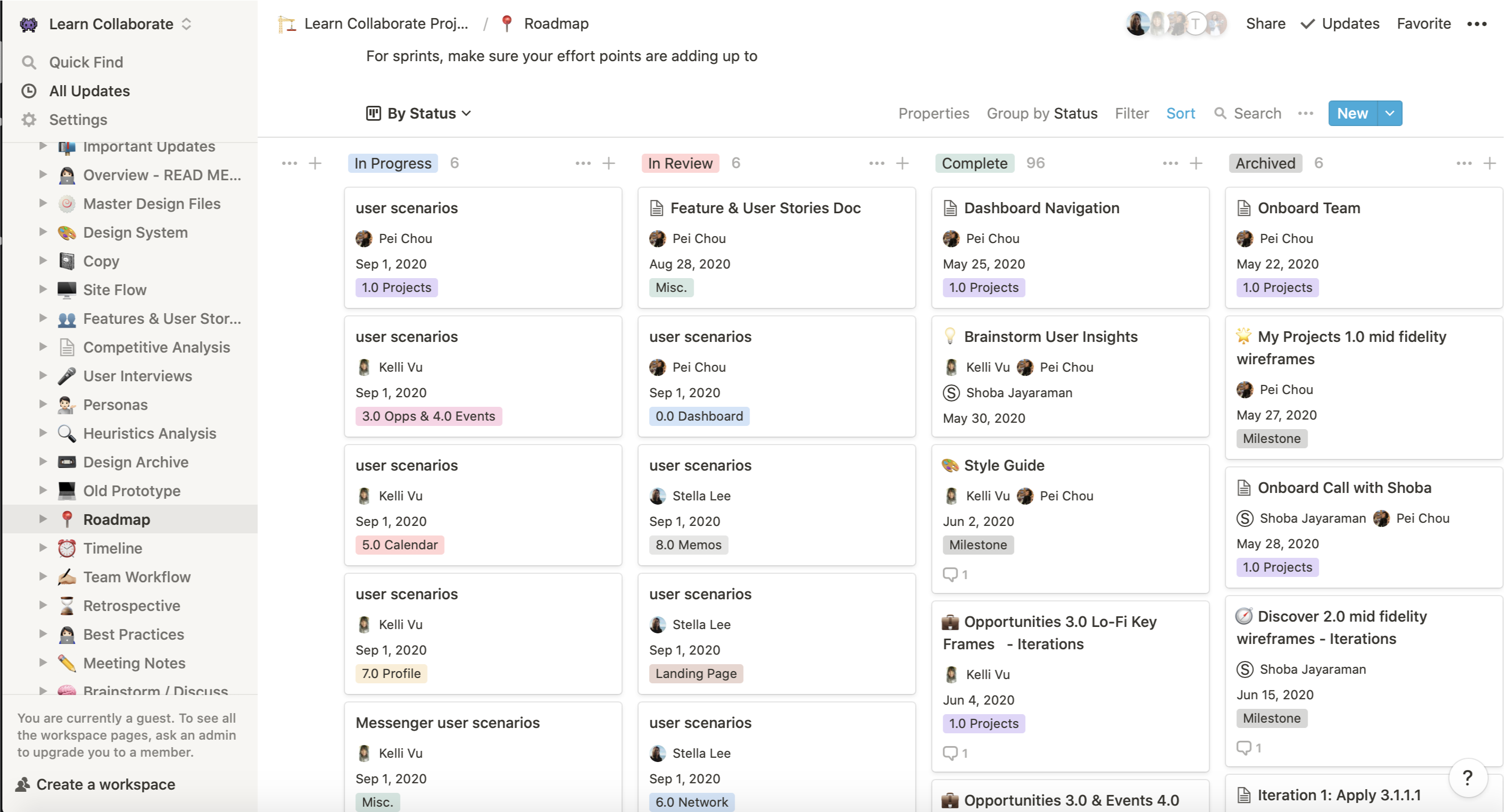
Our team used Notion to organize our documents as well as assign tickets. Each ticket listed a problem statement, user stories, some inspiration photos, and a list of requirements. Each member was assigned multiple tickets due by the end of the week. We each were responsible for different screens as well as making sure our styles and naming conventions stayed consistent, as the design library itself wasn't finalized.
A screenshot of Notion on our last week prepping for the final presentation
Notes Document Editor
One of my tickets included coming up with a notes document editor similar to Google docs for users to easily take notes or start typing out case studies.
Problem Statement
Users need a centralized place where they can directly go from managing their projects to working directly on task deliverables like writing reports, papers, presentations, etc. so they can seamlessly work together to complete a project from beginning to finish.
User Stories
- As a user, I want to be able to create, edit, and organize text documents so I can record and present my work.
- As a user, I want to be able to export my documents into standardized formats so it's easier to share with people outside of the project.
- As a user, I want to be able to create presentation decks so I can present my work to stakeholders.
- As a user, I want to be able to write distraction-free so I can focus on writing the task at hand.
Requirements
- A filing system that shows folders & files hierarchy
- A space to write the document
- Comments
- Show who is on the document
- Sharing options
- Change formats - text doc, tables
- Google, Evernote, Slack, and Notion integration
I analyzed the layouts of different competitors to see how they laid out the different sections and what users were already used to. I found the outline feature of Google docs especially useful, at it helped users navigate easily through longer documents.
My V1 design
My first iteration was clean and minimalist, but the functionality and intuitiveness of the design wasn't quite there. I had included icons on the side, thinking the icons were easily recognizable and text labels weren't necessary. However, a single usability test proved me wrong. In addition, there was too much shifting of sections between the different modes (notice that in Edit mode, the notes outline is on the left, but when switched to Comments mode, the comments push everything to the left and the comments appear on the right. The presentation mode had the slides on the left again similar to the notes outline).
V2 design

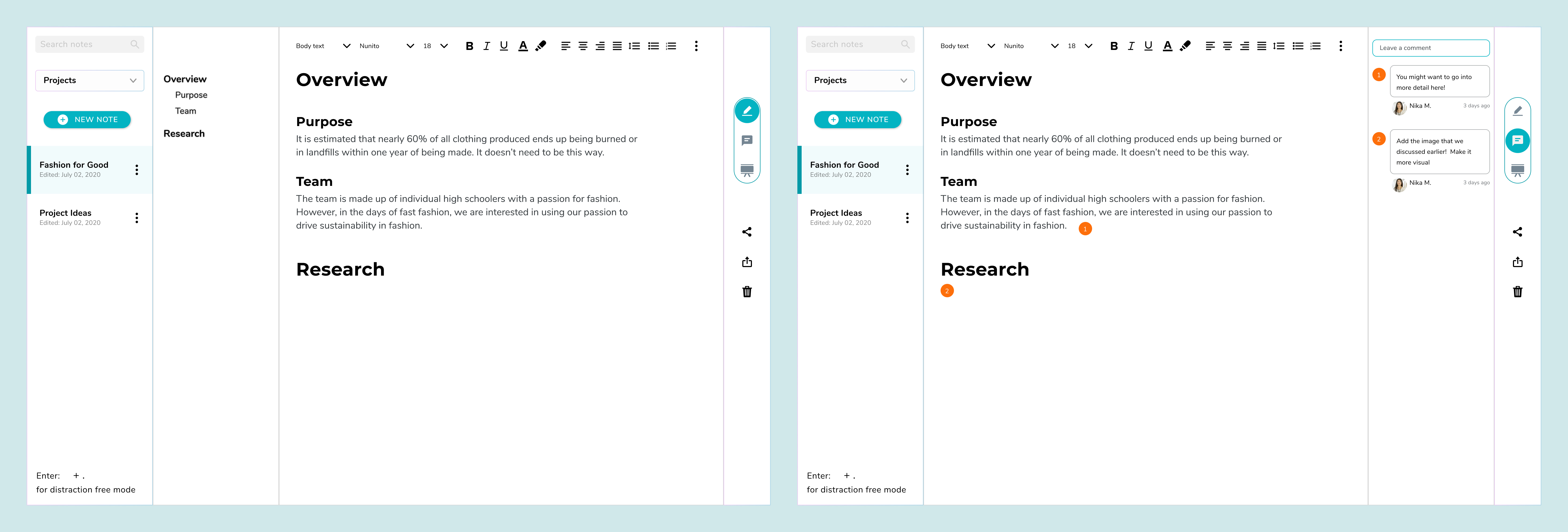
My first iteration was clean and minimalist, but the functionality and intuitiveness of the design wasn't quite there. I had included icons on the side, thinking the icons were easily recognizable and text labels weren't necessary. However, a single usability test proved me wrong. My V2 design looks similar, but I added text labels to the navigation icons, and had comments appear directly on top of the notes instead.
Final version

At this time, the PM finalized the whiteboard screen of this web application. Because these two tools are pretty similar, I adopted the top navigation bar that had been approved so users don't have to learn two different navigation styles. This ended up working perfectly as the comments appear in a separate side panel, allowing for comments to be tagged on both the document editor as well as the presentation editor.

