Website goals
Sweet Chemistry was looking to shift their website platform to Shopify as well as revisit their website UX to expand from wholesale only to B2C capabilities.
- Redesigned the entire website to focus on guiding users through product/brand education to completing purchases
- Designed ads, social media assets, and email campaigns
- Streamlined the brand deck, helping expand the brand into retailers
- Increased user engagement and website traffic
- Increased conversion rate by 1.4%
NOTE: Case study under construction.
Navigation redesign
Designing an expansive navigation menu
Simplifying the user flow
The navigation menu needs to be simple (read: not overwhelming), allow users to easily find information, and communicate what the brand values. Since Sweet Chemistry was new to the scene, educating users was my main focus — while there was a ton of hype among scientists and other skincare brands, the average person tends to have mixed feelings about polypeptides derived from cow bone (if they even know what peptides are).
Below is the original site map the client sent:
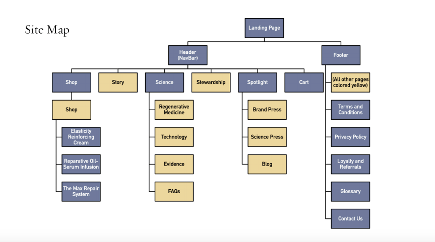
The client and I had a lot of discussions about the navigation menu — Topics such as 'Science' and 'Commitments' were important to the purpose of the brand, and the client especially didn’t want their commitments to be seen as an afterthought, especially since making a difference in their community was integral to the purpose of the brand.
I ended up including more links at the top of the page since it is a new brand and concept, and plan to move links such as the FAQ and Press to the footer once the brand is more established.
I updated some of the page titles to try and make things as intuitive as possible (ie. 'Stewardship' became 'Commitments' to give a more trustworthy impression, and 'Spotlight' became 'Press' as the term is more easily recognizable). I also combined pages when possible to reduce the amount of pages the brand has to maintain as well as what users have to go through (ie. Brand Press, Science Press, and Blog are now on one page).
Homepage redesign
Educational landing page


.webp)
Marketing assets
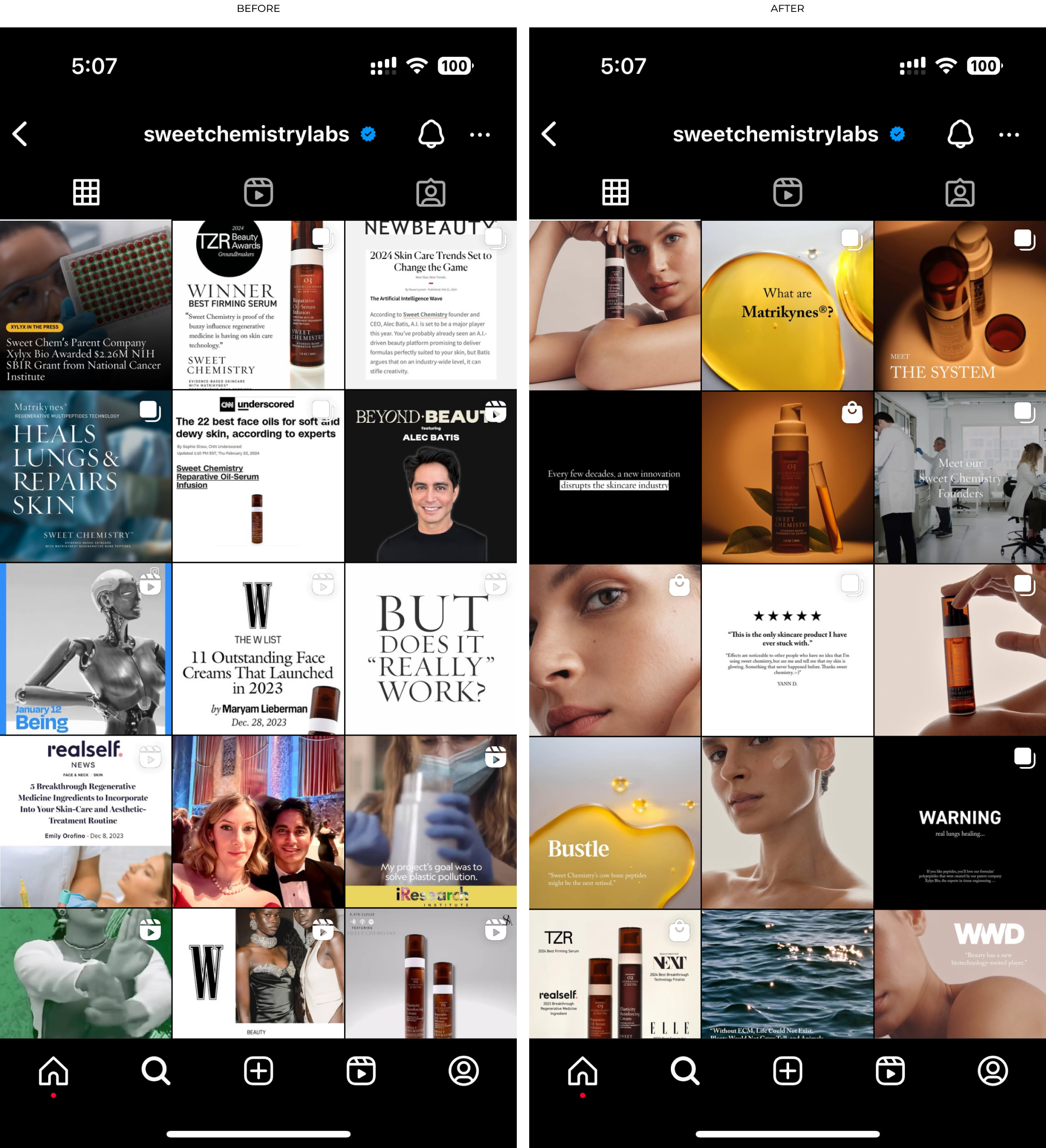
Social media
The goal for our social media accounts was to create a consistent, elevated grid and increase customer engagement and website traffic.
Marketing Ads
Emails